Blog

  • Vibrant and Beautiful Flowers that you can paint right now!

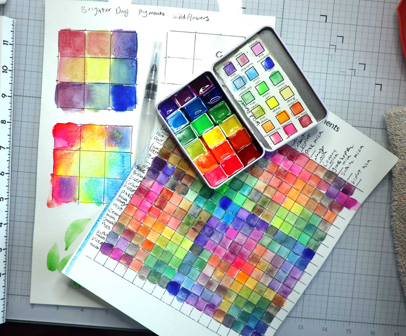
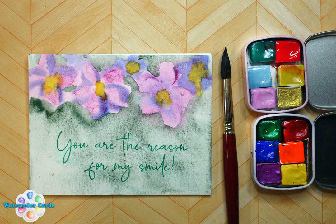
    I recently was given some watercolors from Brighter Day Pigments, and I love them! Rich, creamy, and beautiful pigments from Nancy Olson have won my heart with these handmade watercolors!

    Once I played with these pigments, I knew I needed to paint some flowers, so here is a tutorial on how I use simple shapes to make flowers- literally anyone can do this! I break the flowers down to 5 simple shapes that are easy for you to watercolor.

    I also have some reviews up on these amazing watercolors that have really stolen a piece of my heart! I know that they will steal your heart too!

    Nancy Olson made the Anthropologie Blue and Pink Pouch for Anthropologie! Here is why you will love them:

    I love the ocean, and Shimmer- so when I saw this palette as a set, I had to grab it! The colors in this set have some of my favorite pigments, including Copper Mica, which is one of my all-time favorites!

    If you love these pigments as much as I do, you can use Code: LisaChristensen with this link.

    Also, if you are going to be at Creativation hosted by NAMTA, I will be at the Maker’s Studio demonstrating these beautiful pigments!

  • Learn to use color with Rainbow colors with Rainbow Bright, sunny, and happy handmade greeting cards

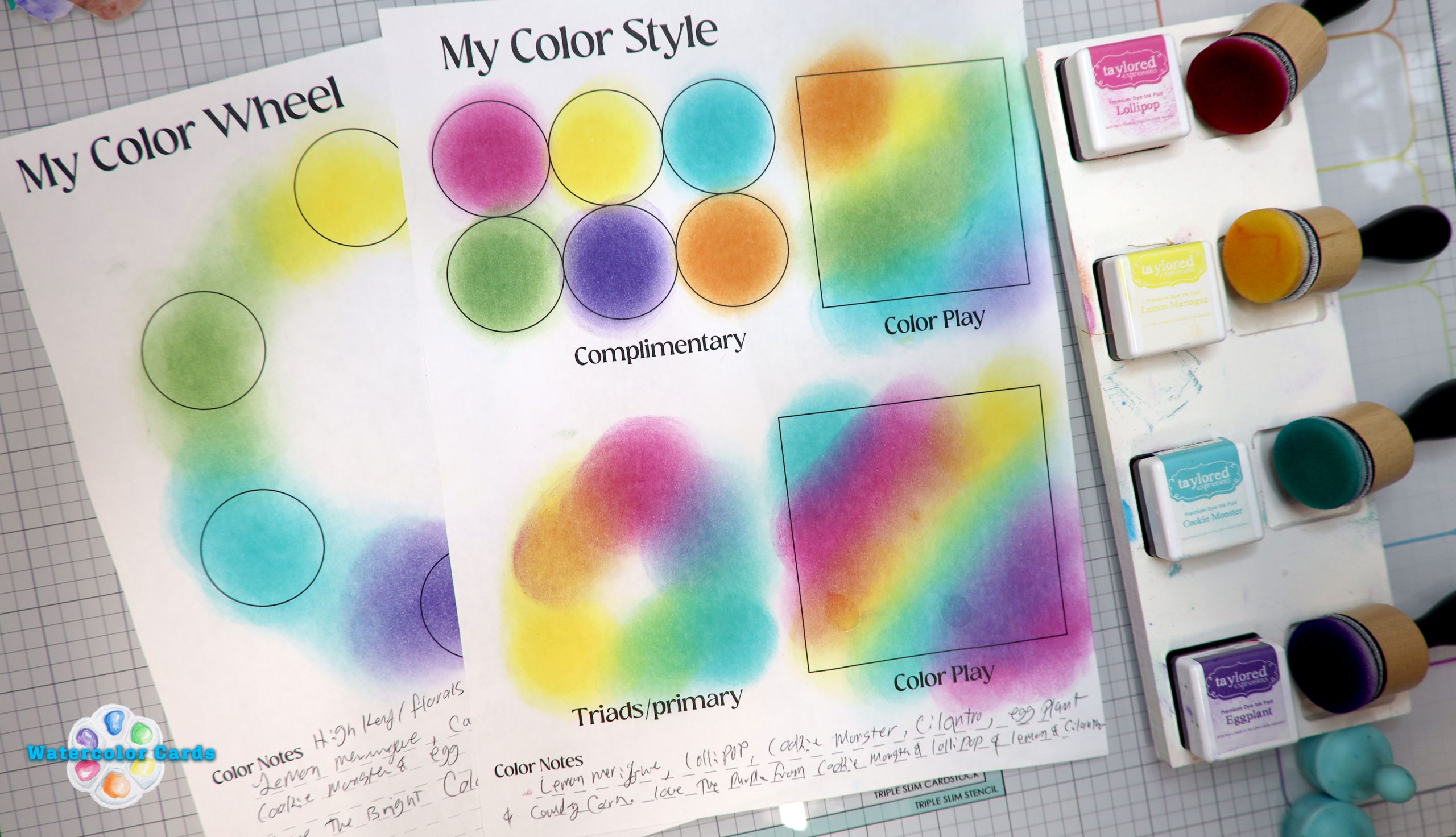
    Learn basic color theory for transparent mediums like ink and watercolor, with Vibrant Spring colors. At the end of this video, you will be able to pick rainbow colors for your watercolor and ink projects.

    My insight on how I learned color theory- the “real way” I have taken lots of graphic design and art classes, and the one class that helped me was while I was taking a workshop with Alexis Lavine when she talked about color- it was magical, and I loved what she said- some of my takeaways were

    Purple is the darkest value on the color wheel. Use it wisely! (I love purple for that reason!)

    Yellow (complementary to Purple) is the lightest value on the color wheel.

    You don’t need every color made; use your favorite, and learn to mix them!

    Onto the heart of the matter: Lets get our fingers inky!

    Learning how the colors play with each other is a fun color journey that I hope will motivate you! That is why I have these color worksheets for you to download and then print so you can use them.

    Each worksheet was designed to print on 8.5×11 paper. Use cardstock or copy paper for your color play adventures! (There are three sheets.)

    Sheet One: Use this to make a color wheel.

    Use this color style sheet for a quick reference to what you can achieve when you blend ink or watercolor. Complementary colors are colors across from the color wheel. A triad is three colors that make up a triangle on the color wheel.

    Use this color style worksheet to help you see what colors work well together on the Color wheel. Analogous colors are 4 colors that are close on the color wheel. I like to add drama in my art, so I usually add the complementary color to my analogous colors. This is also a fun way to discover how to use color in your art practice.

    I hope you find these worksheets to be helpful; they are to me, use them to find your own color discoveries in your artistic style!

    Happy color plays!

    Love,

    Lisa Christensen

  • Welcome to the Wonderful World of Watercolor!

    Welcome, Watercolor Card Artists! I am so happy you are here, and I am happy to share some of my favorite things that deal with watercolor and paper crafting! I made a video to welcome you and to share my love of watercolor with you! If you haven’t subscribed to my YouTube channel, please do- so you never miss a video on watercolor cards!

    Stay tuned to more inspiration!

    You can find me on Facebook at https://www.facebook.com/groups/watercolorcards

    You can find me on my YouTube channel

    https://youtube.com/@watercolorcardslisachristensen?si=Vc1QteKhrUrzKUkK