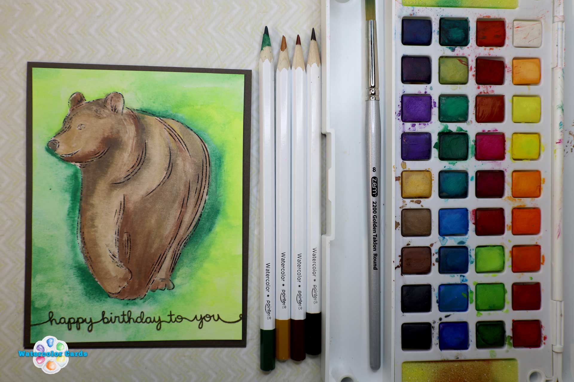
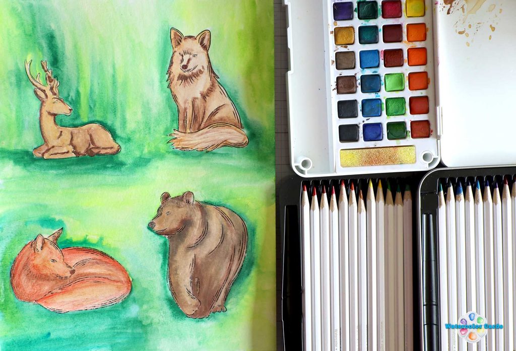
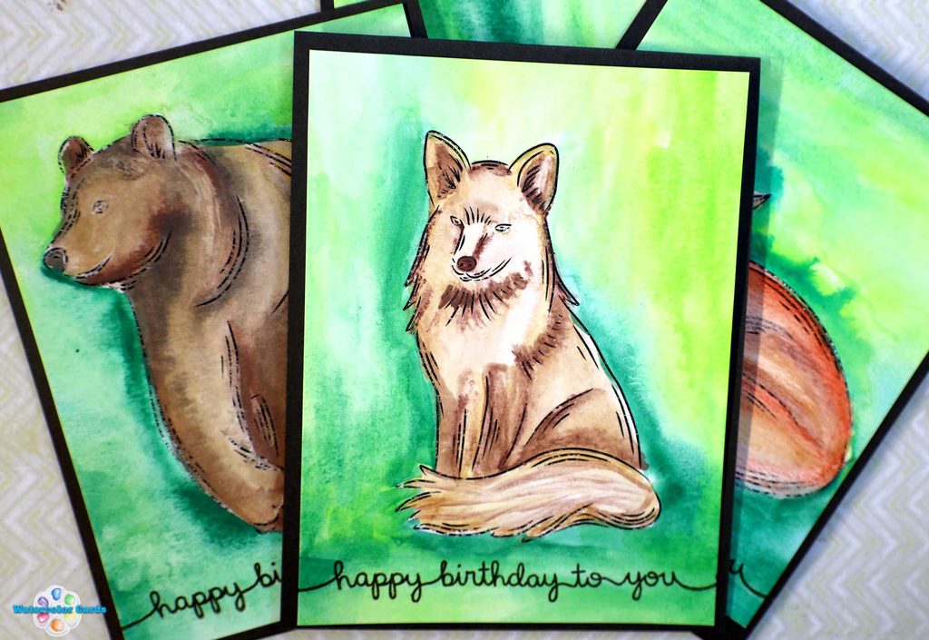
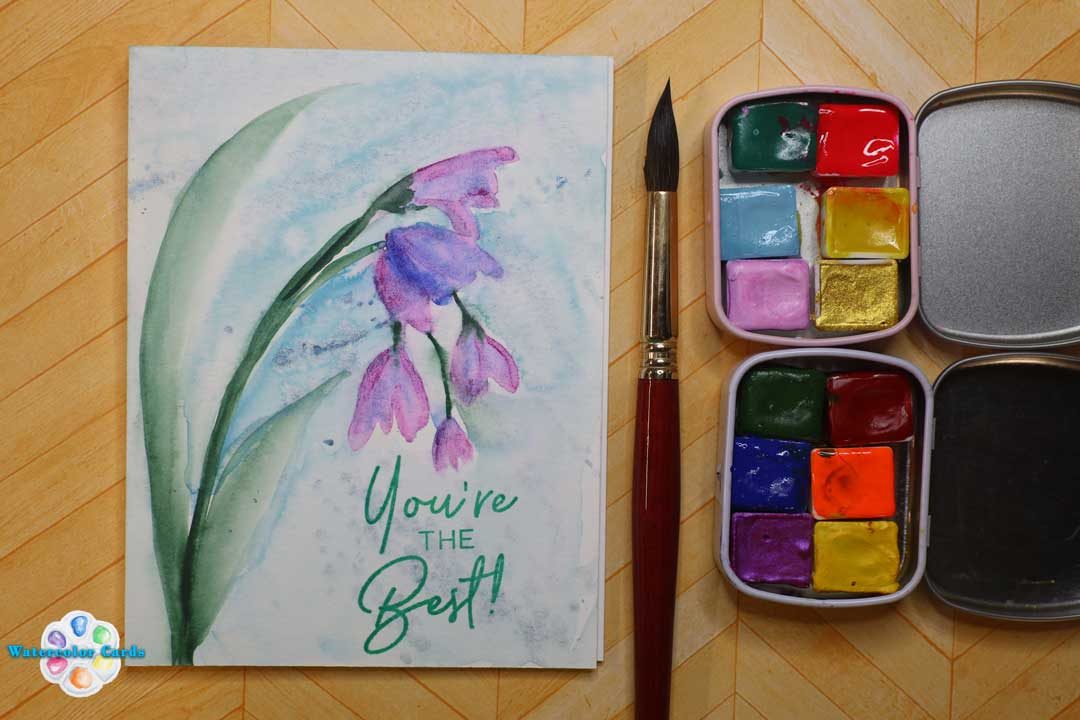
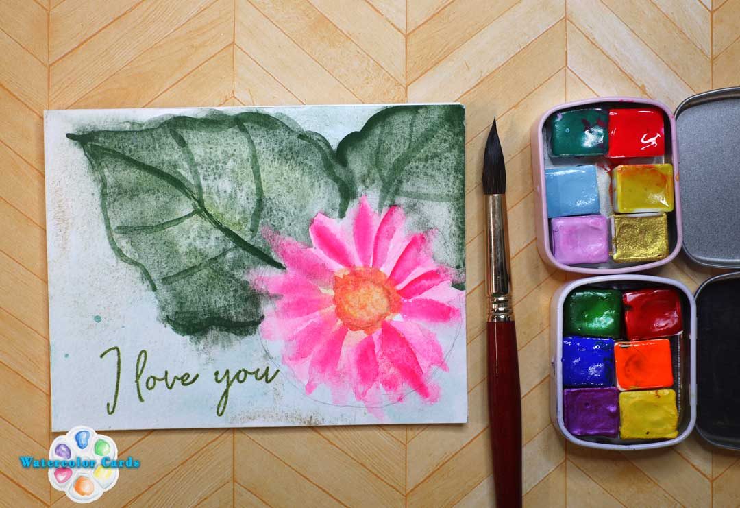
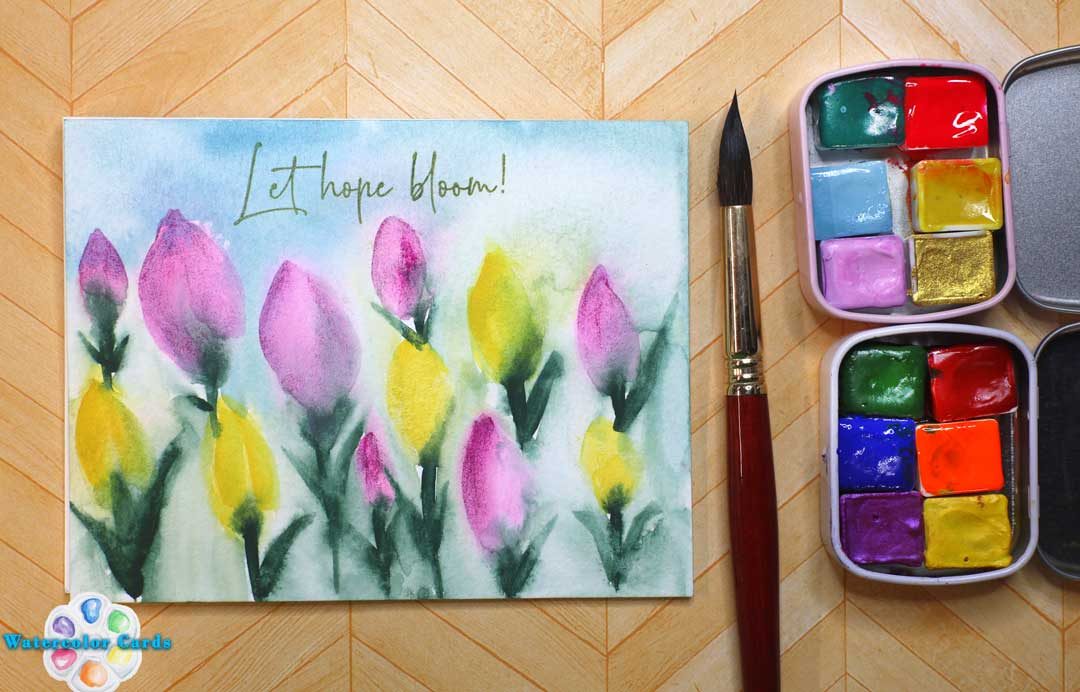
I love using Watercolor Pencils and watercolor together to achieve the perfect look I’m after!
There are a couple of techniques that I love and want to share with you in this tutorial- I love adding watercolor pencil to a wet surface- dry into wet.
Watch this tutorial and see how easy it is to paint these cute animals!
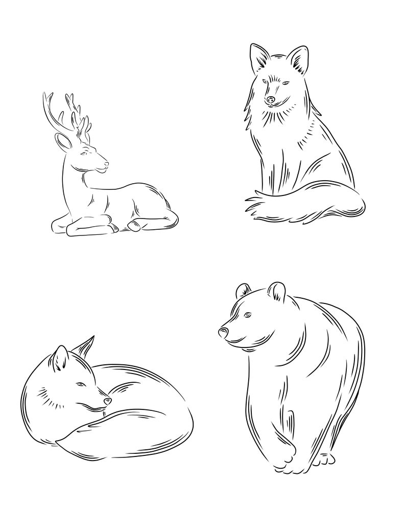
You can find the line drawing for this tutorial by downloading the JPEG.
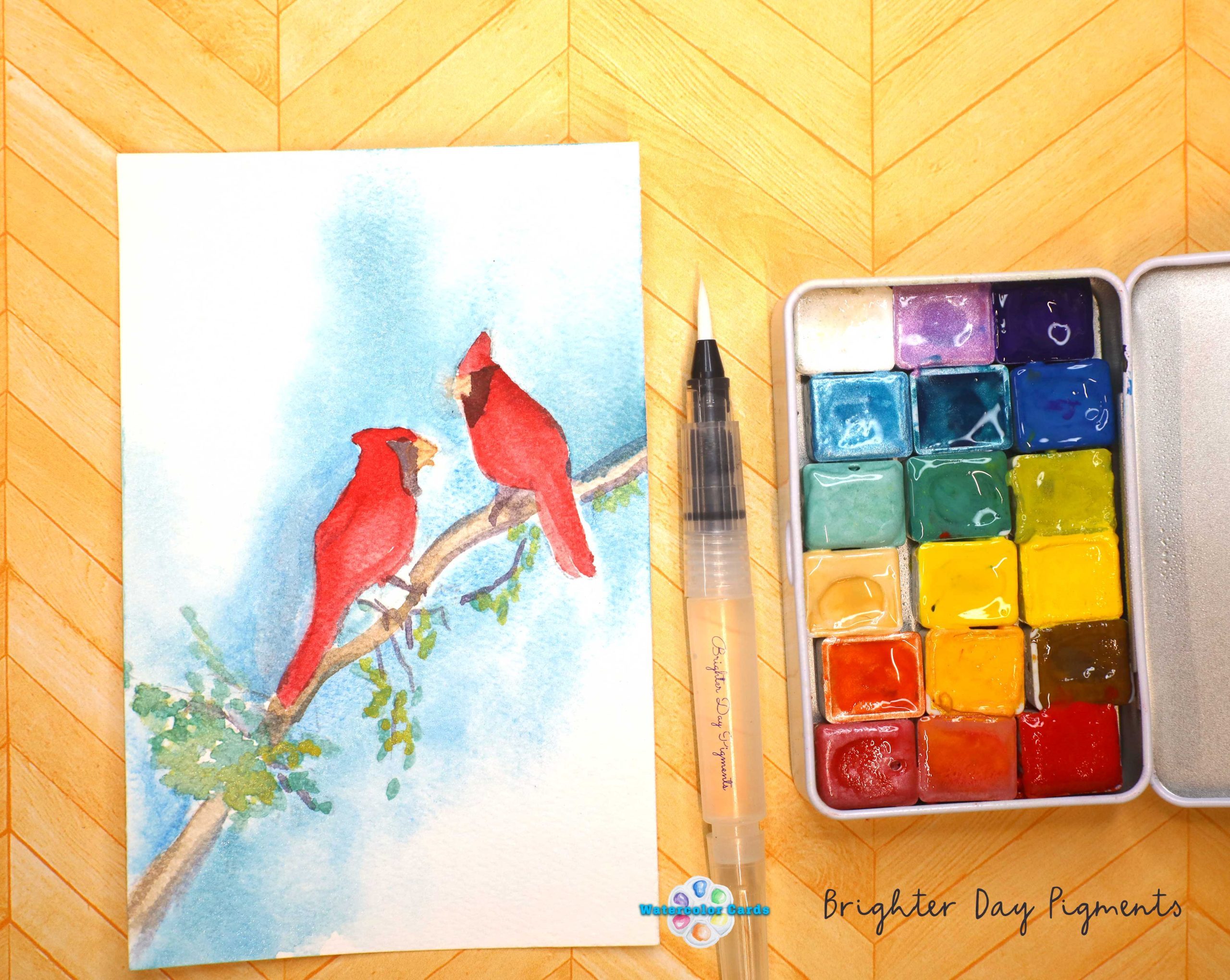
I have found that Pointer WatercolorPencils and Watercolors have a lot to offer at a good price point. I recommend the watercolor pencils and the travel watercolor palette to anyone who is learning to watercolor and wants to try. The price point is well worth the money; the quality is good for student art supplies.
Other videos that I have used Pointer Watercolor and supplies
Ever wondered what to do with a new palette, and wanted to learn more about the power your palette has with all the different types of color ranges you can get with a perfect, curated watercolor palette? This blog post helps you understand what swatching methods and techniques will help you learn about the watercolor properties and their unique characteristics in a fun and non-boring way.
I like to think of color as individual as we are- there are unique properties that manufacturers and pigment makers use to make a color. It’s an art in its own right, and not every color works the same way, and not every manufacturer gives you the same color as you expect. It’s an art form, and that is part of the fun of swatching.
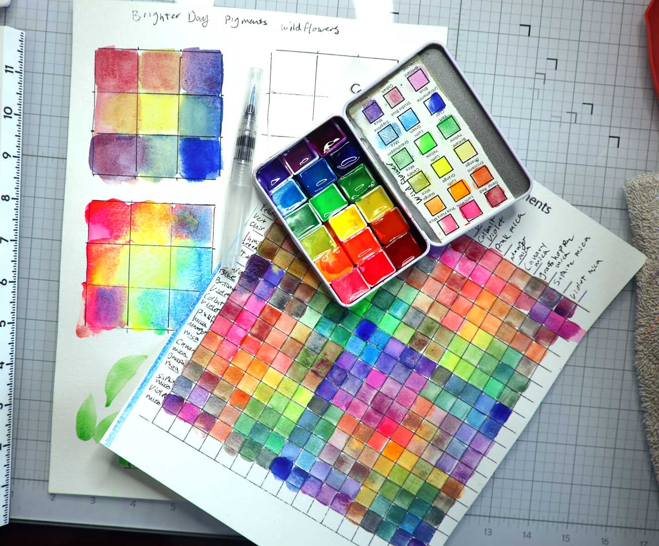
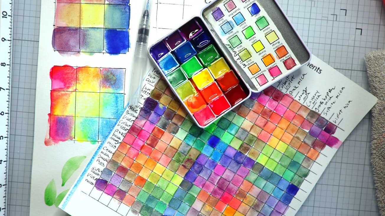
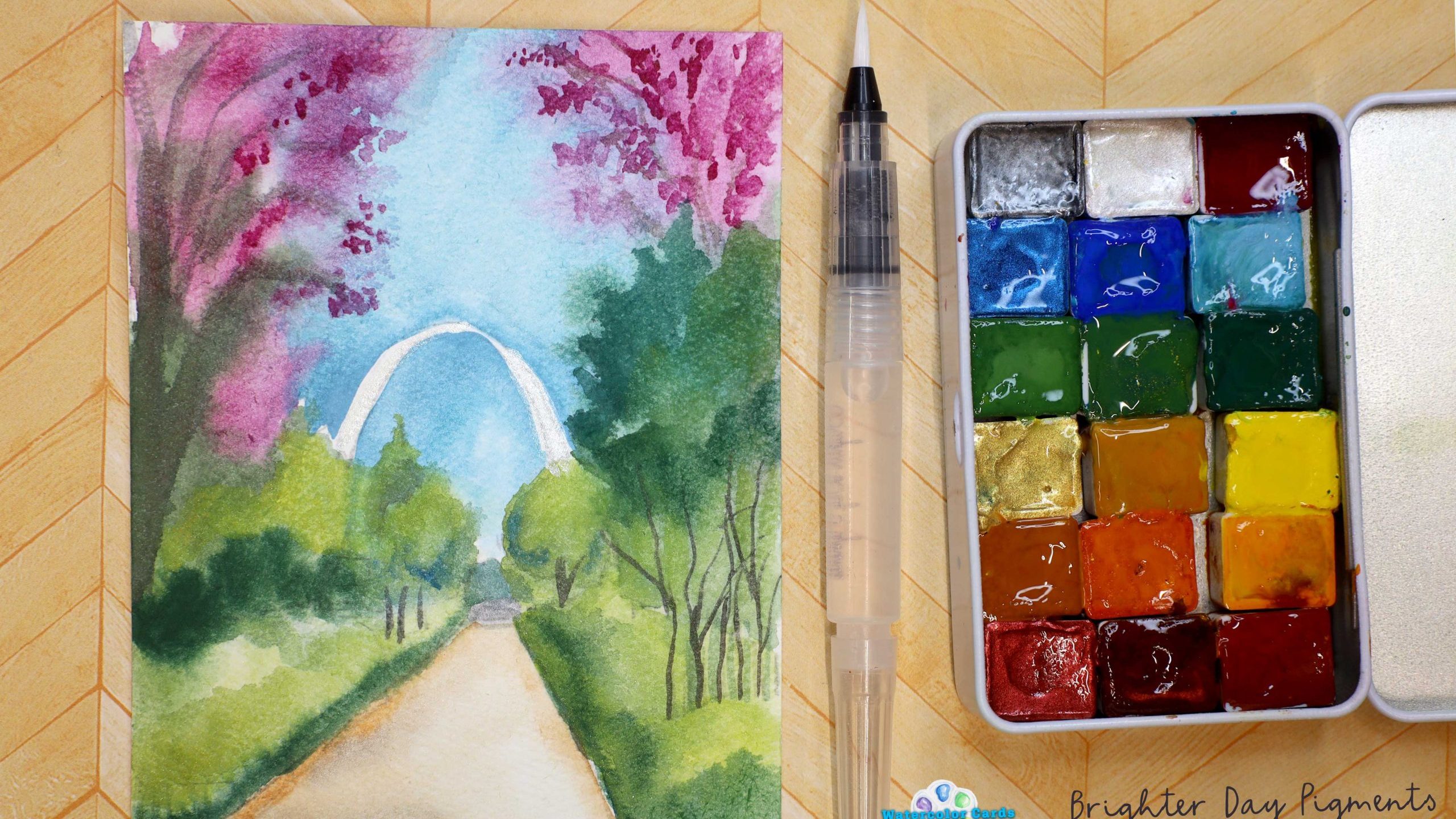
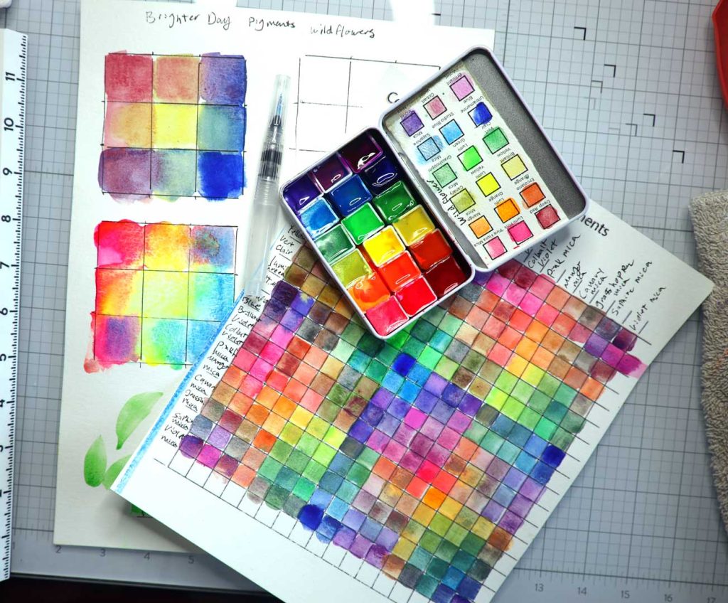
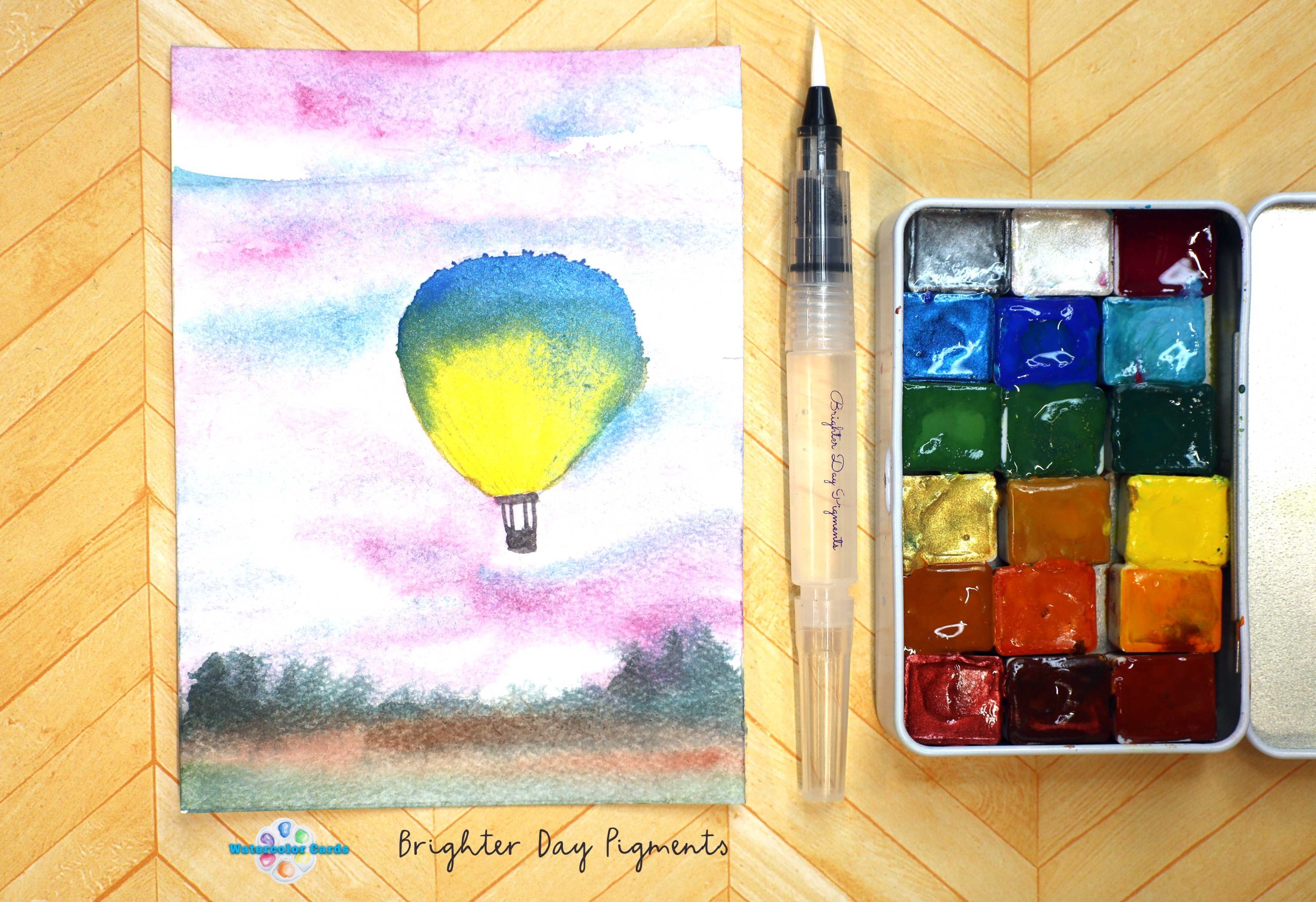
I recently was gifted some Brighter Day Pigments, and wanted to test them out by swatching them. Yes, it did take me 2 hours to make the swatch grid, and yes, I enjoyed every minute of it. Those two hours helped me learn the quality and properties of the pigments, and helped me see what colors I absolutely loved.
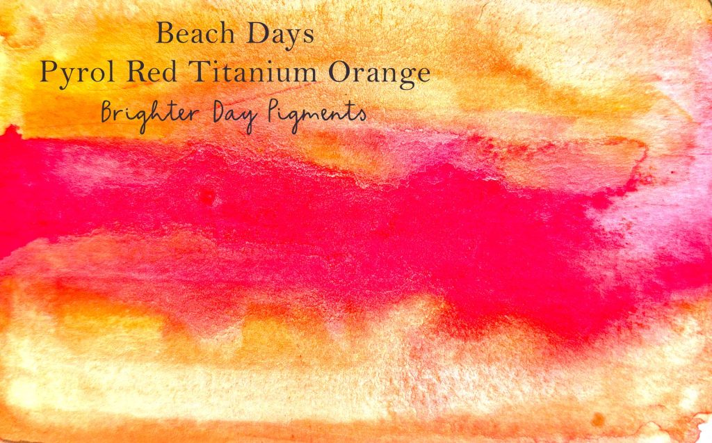
To follow along with this post, use Brighter Day Pigment watercolor palettes. In this blog post, I am using Wild Flower, Beach Day, and Sweet Tooth. Use code: LISACHRISTENSEN for 10% off your order. (Thank you, Brighter Day Pigments.)
How to swatch- Method/technique 1
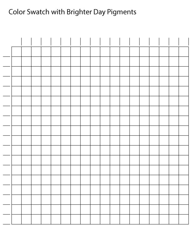
I made a swatch sheet and printed it with my laser printer on watercolor paper. You can download the swatch sheet by saving the picture below to your device.
I label each row and column in order of how I want the swatch sheet to be. For most cases, I want to have pigments together that are in ROYGBIV (red, orange, Yellow, Green, Blue, Indigo, violet) order, and then I do the same for any mica pigments in ROYGBIV order. I like consistency 🙂
To have this time to do this is a powerful way to learn water-to-paint ratio and color theory. I listened to an audiobook while painting, which helps my thoughts and doubts leave, so I am focused on color, painting, and the book. It gave my brain a break from “life”.
Color Swatching method technique 2
like to see what 5 colors will do with each other next to it- so I make a half a color wheel.
I start with my favorite color- and put that in the middle in this example it’s Lumi Orange, then I add the colors closest to the color wheel on each side of the Lumi Orange,(Lumi yellow, and Lumi Pink.) Then I end the half circle with two other colors that would be next to those colors on the color wheel( Lumi Green and Cobalt Violet)
This is a great way to learn how colors work and mingle with each other, in a simple, easy way to test and swatch colors.
Color Swatching method technique 3
I like to see what colors mingle well with each other- so I have one more swatching technique. With this one, we are looking at the color relationships, as they are, with no mixing needed: Warning- you will be addicted to this one.
One more example:
You can download the practice sheet here:
Color Swatching method technique 4
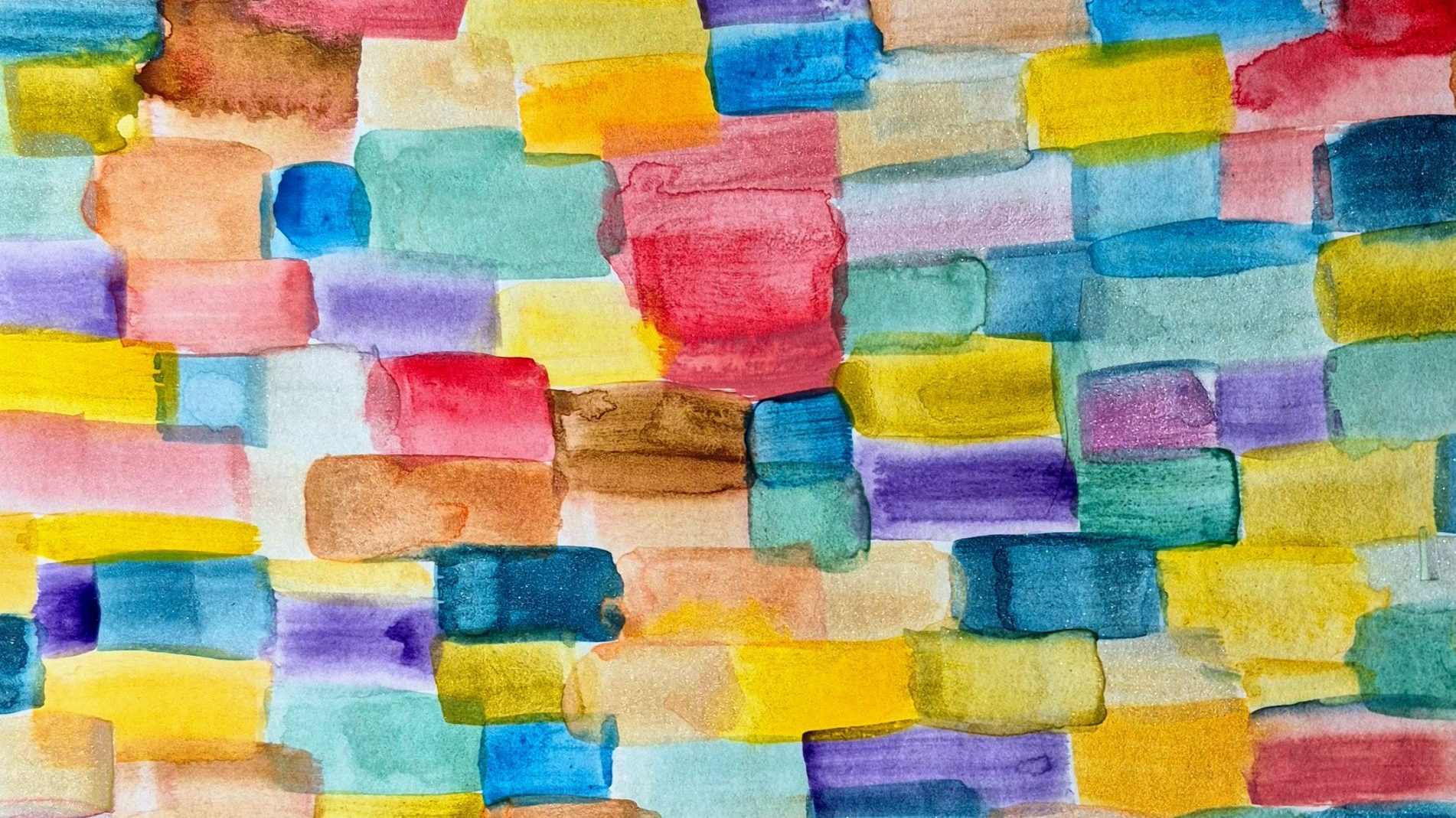
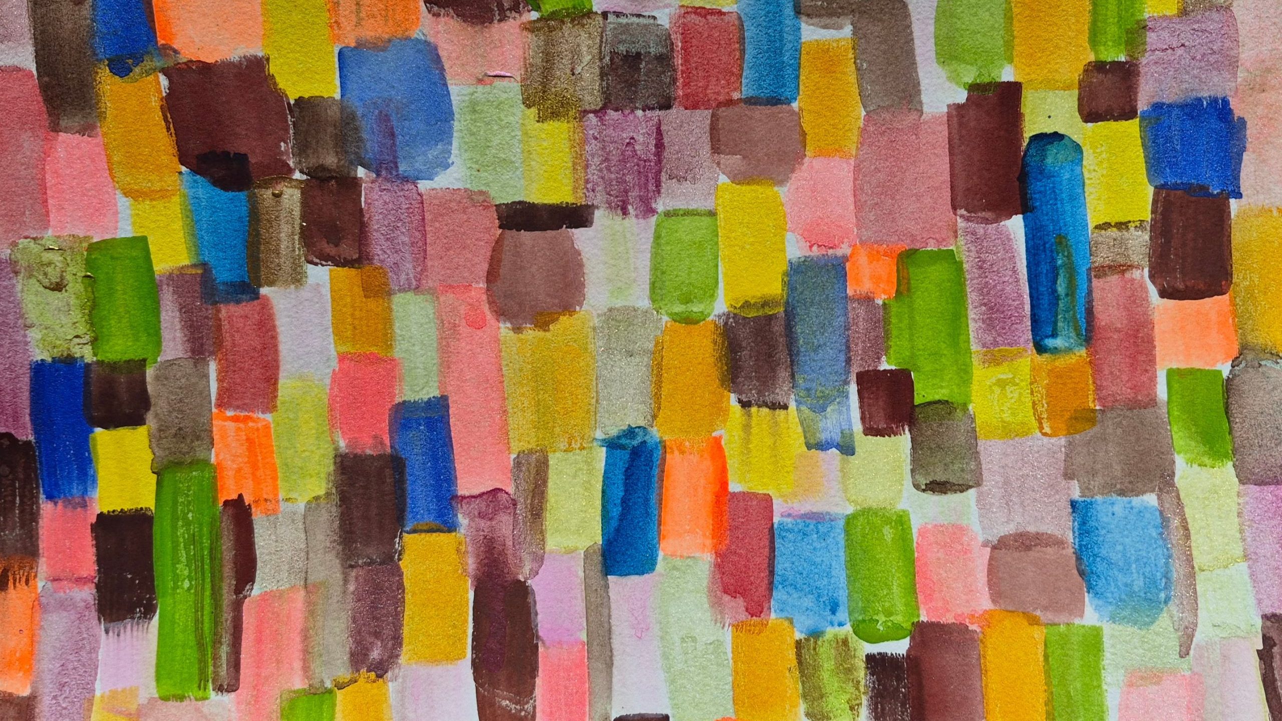
I take a sheet of watercolor paper, this one is 9×12, and I fill it up with small strips of watercolor using a small flat brush. I don’t make the shapes uniform, and I just go with the flow. I love this becuase you can do this with any of your palettes. If you find that you have white space, then you can glaze over a color and see if you like it. I adapted this technique from Lisa Solomon in her book A Field Guide to Watercolor.
I love this way of swatching colors; it’s a way to explore your watercolors and play with landscape compositions. When you strip down to just shapes and colors, you can start to see what works in a landscape painting and then become a better landscape artist.
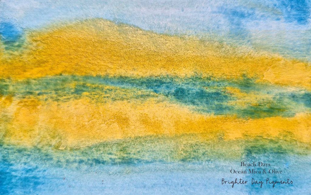
In the example above, I chose a green gold and a cobalt mica color, and I wanted to see what they would do together, so I played. I took a small 3x4ish size rectangle, outlined it with a pencil, so I had a guideline, and then I just painted with one simple rule- 2 colors with a landscape in mind.
I love using two colors that are complementary; they always give me a rich neutral that works very well in landscapes. Can you see how mountains were in my mind with this quick swatch?
You can have a lot of fun with this technique. If you want to read more about how this swatch exercise came to be, you can read the book Everyone Can Watercolor by Kateri Ewing
I would love to hear how you like to swatch your watercolors?
I recently was given some watercolors from Brighter Day Pigments, and I love them! Rich, creamy, and beautiful pigments from Nancy Olson have won my heart with these handmade watercolors!
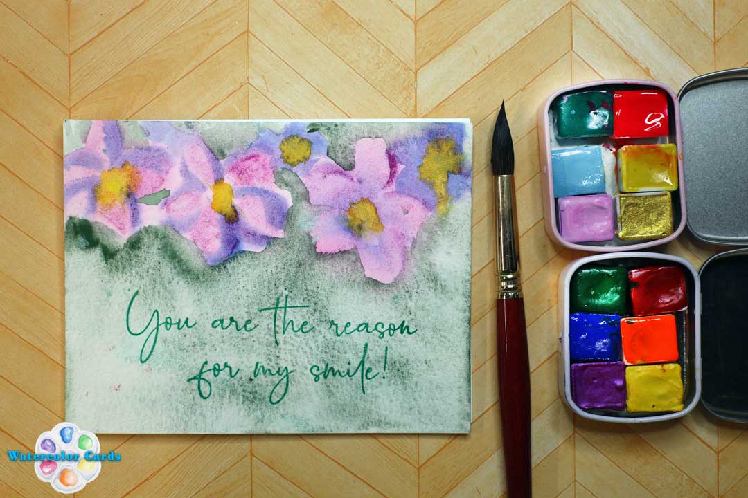
Once I played with these pigments, I knew I needed to paint some flowers, so here is a tutorial on how I use simple shapes to make flowers- literally anyone can do this! I break the flowers down to 5 simple shapes that are easy for you to watercolor.
I also have some reviews up on these amazing watercolors that have really stolen a piece of my heart! I know that they will steal your heart too!
Nancy Olson made the Anthropologie Blue and Pink Pouch for Anthropologie! Here is why you will love them:
I love the ocean, and Shimmer- so when I saw this palette as a set, I had to grab it! The colors in this set have some of my favorite pigments, including Copper Mica, which is one of my all-time favorites!
If you love these pigments as much as I do, you can use Code: LisaChristensen with this link.
Also, if you are going to be at Creativation hosted by NAMTA, I will be at the Maker’s Studio demonstrating these beautiful pigments!