Learn basic color theory for transparent mediums like ink and watercolor, with Vibrant Spring colors. At the end of this video, you will be able to pick rainbow colors for your watercolor and ink projects.
My insight on how I learned color theory- the “real way” I have taken lots of graphic design and art classes, and the one class that helped me was while I was taking a workshop with Alexis Lavine when she talked about color- it was magical, and I loved what she said- some of my takeaways were
Purple is the darkest value on the color wheel. Use it wisely! (I love purple for that reason!)
Yellow (complementary to Purple) is the lightest value on the color wheel.
You don’t need every color made; use your favorite, and learn to mix them!
Onto the heart of the matter: Lets get our fingers inky!
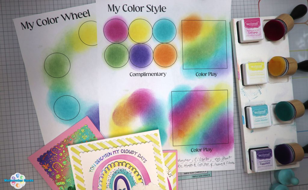
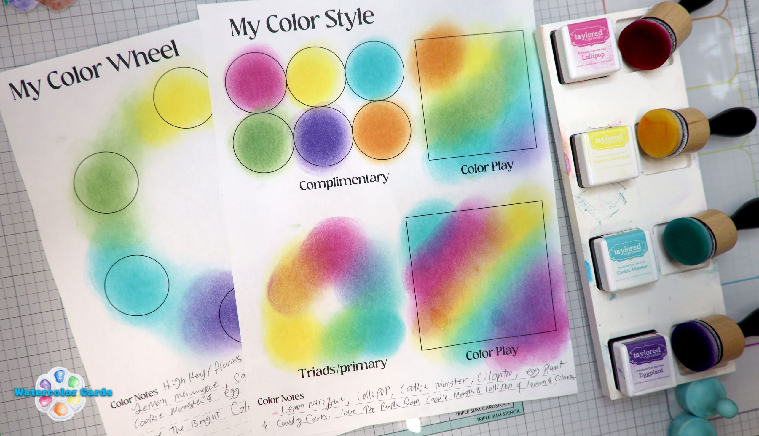
Learning how the colors play with each other is a fun color journey that I hope will motivate you! That is why I have these color worksheets for you to download and then print so you can use them.
Each worksheet was designed to print on 8.5×11 paper. Use cardstock or copy paper for your color play adventures! (There are three sheets.)
Sheet One: Use this to make a color wheel.

Use this color style sheet for a quick reference to what you can achieve when you blend ink or watercolor. Complementary colors are colors across from the color wheel. A triad is three colors that make up a triangle on the color wheel.
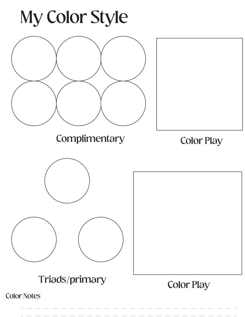
Use this color style worksheet to help you see what colors work well together on the Color wheel. Analogous colors are 4 colors that are close on the color wheel. I like to add drama in my art, so I usually add the complementary color to my analogous colors. This is also a fun way to discover how to use color in your art practice.

I hope you find these worksheets to be helpful; they are to me, use them to find your own color discoveries in your artistic style!
Happy color plays!
Love,
Lisa Christensen
Leave a Reply